
Case Study : Redesign of TNSTC website to make it more accessible and responsive
🚌What’s TNSTC and What does this case study entail?
The Tamil Nadu State Transport Corporation (TNSTC)🚌operates a vital transportation network across Tamil Nadu, serving millions of passengers daily. The existing TNSTC website is outdated, lacks user-friendliness, and fails to meet accessibility standards. To enhance user experience, increase usability, and ensure inclusivity, I decided to redesign to improve usability and accessibility.
To give a small glimpse of how the site currently looks like now: you can visit www.tnstc.in or see the screens below


As you can see above, there are various issues that we can find just by giving a glance. The colors are inaccessible, lack contrast, fonts are small, no feedback etc. I have done a detailed heuristic evaluation report, that I would be showcasing in detail below.
Objectives of this project:
Enhanced User Experience: Improve the overall look and feel of the website to provide a more modern and pleasant user experience.
Responsiveness: Ensure that the website is fully responsive, catering to users across various devices and screen sizes.
Usability: Streamline the website’s structure, navigation, and content presentation to make it more user-friendly and intuitive.
Accessibility: Meet accessibility standards (WCAG 2.1 AA) to ensure that the website is usable by people with disabilities.
Before getting to the point, let me explain how I used the process of design thinking to come up with the redesign solution for the TNSTC Bus App.
I incorporated the idea of Design Thinking — Empathise, Define, Ideate, Prototype and Test to come up with highly intuitive and useful design for the feature.
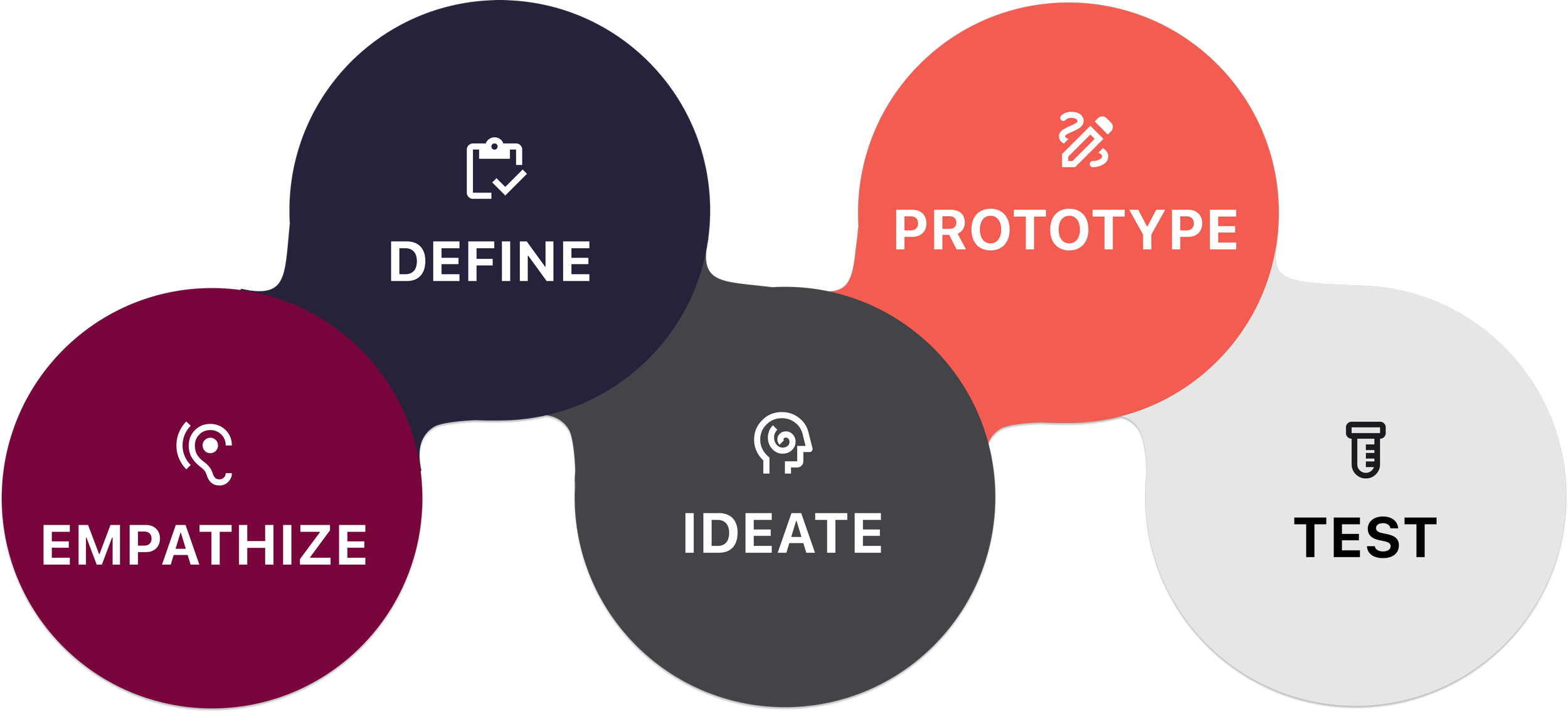
🔬Empathise — Research, research until you get some insights:
The first step was to understand if the problem I assumed was a problem was actually a problem. Hahaha, did that sound like a tongue twister?
That’s where the phase of Empathise comes in, where I had to do some digging and research to understand if this was indeed a problem that needed addressing and what are the other aspects and factors surrounding that problem.
For this project, since it was a redesign project, I had to work only on the existing site to understand further.
🕵🏻♂️ Heuristic Evaluation :
According to Adamfard.com, 80% of the usability issues can be discovered by doing Heuristic Evaluation of a site. Using Neil and Norman’s 10 usability principles, I worked on discovering the usability issues in the site. Some of the heuristic evaluation are as follows:


Accessibility Issues Report:
In addition to the above evaluation, I also worked on accessibility evaluation and uncovered some major accessibility issues. As per Indian Government, all state-run government sites should also be accessible and should adhere to standards.

Based on understanding of the site and the common users in tamilnadu and looking further into commuters and people who use the site, I built a provisional user persona for the commutator/user of the TNSTC site.

Based on the issues identified early on in the website, I created the provisional persona — Rahul, who is a visually impaired individual who relies on screen reading software. He travels for both work and personal reasons and he’s looking for a website, that’s both affordable and seamless to use.
After having the provisional persona, I worked on creating the user journey map for the provisional user.

📝 Define — Identify and Address the problem head on:
I utilised the power of Point of View (POV) statements to uncover the needs and aspirations of the users. These concise summaries allowed me to empathise with their perspective and gain a deep understanding of their goals, pain points, and desired outcomes. By crafting POV statements, I effectively addressed the unique challenges faced by users and designed solutions that catered to their specific needs.
This user-centric approach enabled me to create impactful and meaningful experiences that drove positive outcomes and eventually the “How Might We” questions. Basically, we analyse the problem and try to narrow it down to How Might We solve the problem. I came up with a big list of all the possible How Might We questions, but these two questions stood out to me and I figured it definitely needed some addressing.

💡Ideate — On the problems to generate appropriate solutions:
Brain Storming:
From so many of the ideas that I brainstormed, I felt some ideas to be most appropriate and also stayed in alignment with the problem I was trying to solve. I came up with these ideas using the SCAMPER technique for the “How Might We” question.

Features Matrix :
The next step in the process was Feature Matrix — where I jotted down all the features I foresaw in my application and I had to prioritise them based on categories, viz. Must-Have, Nice-to-Have, Surprising-to-have and Can-come-later. I identified the following and this is how I categorised them:

Once I had decided upon the important features that I’m going to incorporate on the website, I worked on the Information Architecture of the site.

⚙️Prototype — To have a look and feel of how the app would be like :
Based on the information architecture, I built the wireframes. I built the low fidelity wireframes. Then I went on to create mid fidelity wireframes as shown below.
The mid-fidelity screens were created for the responsive site — for both mobile and desktop versions.

Branding — UI Kit :
Once I had the mid-fidelity screens reads I had to transition to higher fidelity screens and eventually UI design. Before that I wanted to decide upon the branding. I finalised upon the color palettes and typography.

Visual Design — UI :


Once the high fidelity UI screens were completed, I created interactive prototype
Interactive Prototype :
Once the UI was completed, I went ahead to create the Interactive Prototype. Please find the prototype in the form of video below:
A comparison between the old and the new :
Now that we have the new and shiny interface for the TNSTC page, let’s see how different they are in terms of looks, consistency and usability.


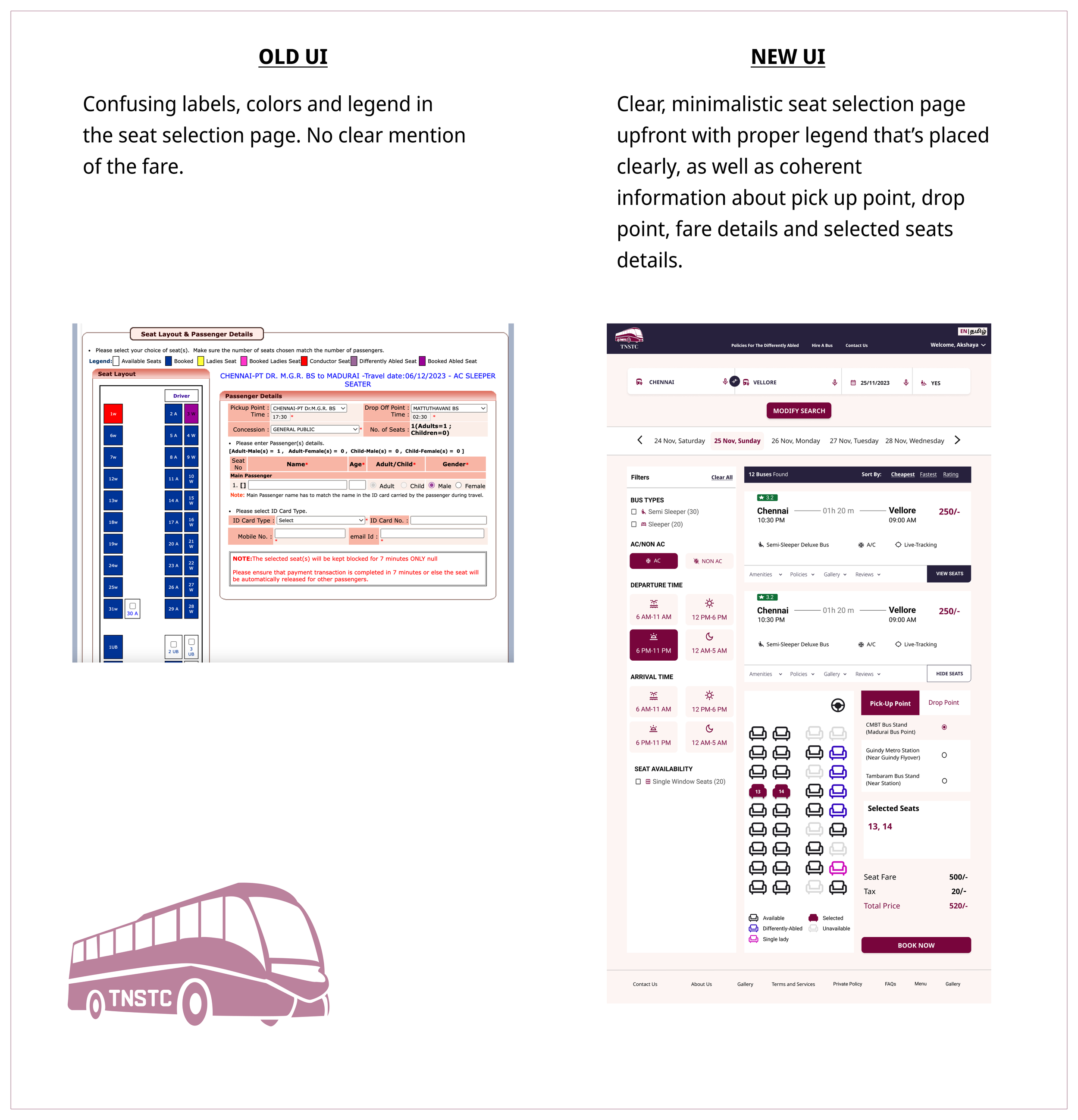
As we can see above, there’s improvement both in terms of usability and accessibility (color, font, spacing, design etc) and users would definitely benefit from such an improved prototype as compared to the existing working site
Testing - Did we do fine?
Feedback and Recommendations :
I tested the protoype to 3–5 participants for usability testing and their feedback is as follows:
Old UI:
1.Cluttered layout with excessive information on a single page.
2. Inconsistent color schemes, and unappealing visuals.
3. Font choices weren’t that appealing and impacts readability
4. The whole booking process seems to be old, leading to user frustration.
New UI:
1. Streamlined design, organized information, and a clear hierarchy, reducing visual noise.
2. The new UI has visually appealing design enhancing the overall user experience.
3.Consistent font choices which enhance the overall reading experience.
4.Streamlined booking flow, clear steps. It has the interactive seat maps, which contributes to an engaging and user-centric experience
Recommendations:
1. I didn’t see this but maybe there should be an option to choose return tickets. Consider offering a default return date based on common user patterns, simplifying the booking process for those who often choose round-trip options.
2. After searching for the bus routes, there were a good number of ‘sort by’ options, I think you can add one more option by ‘departure time’
Next Steps:
I’m currently working on the accessibility documentation to add more features to the people with who are differently challenged. I will also explore more on adding policy documentation for people who are differently challenged to make the site more inclusive and accessible. If possible, once that part is complete I’ll mail it to the concerned people so that they would consider making the site more usable.