
Case Study -Swiggy : Change the world by donating one meal at a time!
Imagine you’re a person with a passion for food and a heart full of kindness. You order your favourite meal, but this time, something’s different. Your food delivery app, Swiggy, is now your partner in making the world a better place, one meal at a time! 🥗❤️
How, do you ask ? I’ve come up with this interesting idea to turn your Swiggy app into a food-sharing superhero. It’s like having a buddy that helps you satisfy your hunger as well as your heart! 🦸♂️🍕

Apart from supporting food delivery app, Swiggy also supports instamart (grocery delivery), dineout (to pick restaurants) and genie(parcel delivery). If it were left upto me I would add one more capability — that is Donations (Charity meal delivery)
So why food donation, you may ask?
I felt this is essential because it turns ordering food into an opportunity to help others. It’s like turning a regular meal into a special gift for someone who might not have enough to eat. It’s a way for us, the food lovers, to make a real difference and share our good fortune with those who need it most. It’s not just about ordering food; it’s about spreading kindness and making the world a better place, one meal at a time.
Before getting to the point, let me explain how I used the process of design thinking to come up with this design/solution of meal donation feature in the Swiggy App.

I incorporated the idea of Design Thinking — Empathise, Define, Ideate, Prototype and Test to come up with highly intuitive and useful design for the feature.
🔬Empathise — Research, research until you get some insights:
The first step was to understand if the problem I assumed was a problem was actually a problem. Hahaha, did that sound like a tongue twister?
That’s where the phase of Empathise comes in, where I had to do some digging and research to understand if this was indeed a problem that needed addressing and what are the other aspects and factors surrounding that problem.
👩🏽💻Secondary Research aka scouring the internet for insights :
I started with Secondary research, where I looked up multitude of articles and citations on food donation and how important it is. Some of the key insights I gathered are as follows:

Also, I gathered more information on existing technology and other apps that offer similar services and conducted a competitive analysis on the same:
🎙User Interviews aka fun-insightful-conversations :
This was the most joyous task because
There were so many insights that confirmed or validated my assumptions and
I got to talk to people with whom I hadn’t talked to, for a very long time.
Keeping in mind the research goals and objectives, I drew up a research plan that had some pretty interesting and thought-provoking questions and after narrowing down to 7–8 research participants (who were extremely involved and interested), I put on my “researcher cap” and conducted my interviews.
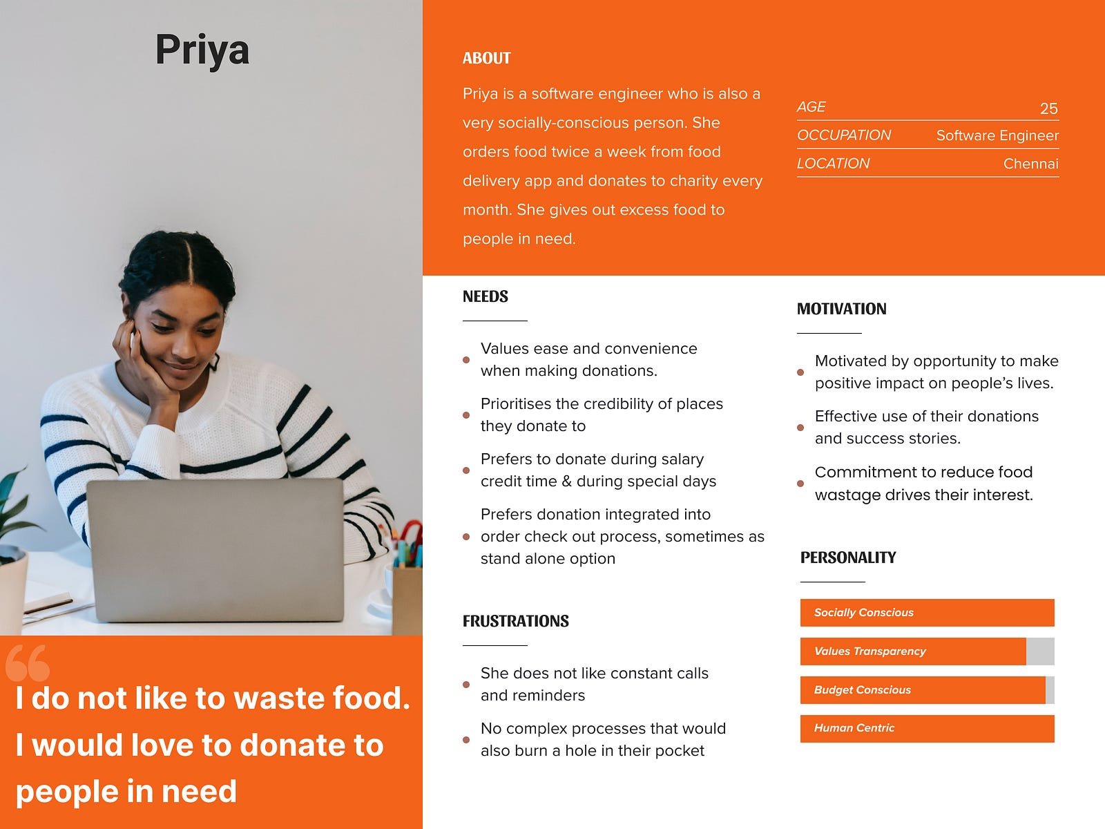
From the user-interviews I was able to come up with user persona as follows:
📝 Define — Identify and Address the problem head on:
I utilised the power of Point of View (POV) statements to uncover the needs and aspirations of the users. These concise summaries allowed me to empathise with their perspective and gain a deep understanding of their goals, pain points, and desired outcomes. By crafting POV statements, I effectively addressed the unique challenges faced by users and designed solutions that catered to their specific needs.
This user-centric approach enabled me to create impactful and meaningful experiences that drove positive outcomes and eventually the “How Might We” questions. Basically, we analyse the problem and try to narrow it down to How Might We solve the problem. I came up with a big list of all the possible How Might We questions, but these two questions stood out to me and I figured it definitely needed some addressing.

I also drew up the user journey to understand the interaction of the user on the app:

💡Ideate — On the problems to generate appropriate solutions:
Brain Storming:
There were two kinds of ideas that I generated for the two HMW questions. I used the SCAMPER technique and MASH UP techniques to generate ideas

Using priority matrix, I zeroed down on two most important ideas that I decided to finally incorporate on my prototype/wireframe:
And the award goes to:


Once the features were finalised, I went on to create the Information Architecture, which is basically how the pages would look like and what are the various sections that they would have.


⚙️Prototype — To have a look and feel of how the app would be like :
Once the architecture was decided upon, all I had to work on was the final designs or simply prototype.
Unlike my other projects where I had to put in extensive work for branding, Swiggy had its own branding and I had to simply make use of them.
I took some existing screens to understand the color palettes and typography that Swiggy was using. Once I had an undersanding of that I went ahead and started building the wireframes/ screens/ UI directly with the help of the information architecture of the site.
This time, since it was going to be only few features that were going to be added, I directly started building components.

After building/creating the components, the next step was to start building the screens for the features.
Donation Feature

Pay it Forward Feature


Interactive Prototype :
Once the features were added , I was able to create interactve prototypes with the screens that I had created.
The interactive prototype had all the important and essential screens and the flow was seamless and merged with the Swiggy Brand.
🧩 Testing — Did we do fine?
Usability Testing:
Usability testing was conducted with 5 participants each of whom had given effective and useful feedback that really helped in improving the prototype further.
Fortunately, almost all of my key participants loved the features and didn’t have a lot of feedback.
Some of the “what worked” points were:
It’s very simple and intuitive
It didn’t seem like you added anything manually. It seems like it’s pat of Swiggy’s business
I loved the “NGO” page. It’s very descriptive and straight forward. It has clearly what is required and also option to schedule donations.
The testimonial on the donations home page makes it very trust-worthy. It would definitely motivate me to donate if I know where my money/food is going.
Some of “what could be better” points were:
I wish I could see the entire flow to see what happens after I pay.
How could I use the Karma points in future? Is there any description to that.
I would love to see how the “Schedule Donation” feature works.
Key Learnings and Next Steps:
Based on my research goals and synthesis, I feel like I have done enough justice to the user’s motivation. I have solutioned for two ways by which they could donate, either directly or theought the “Pay it forward” option. The feedback from the usability testing was immensely helpful and my work has garnered some attention and appreciation. The next step would be to elaborate on the Karma points and how it would be used and also show the schedule dontation flow. Once it’s done I’m looking forward to mailing it to Swiggy to understand if it makes sense and it would help them in anyway.